
Journal.
Websites are Not Print: Pay Attention to the Movement.
The front-end of a website is, naturally, the part that visitors see. The branding, images, illustration, typefaces, overall layout. That these visual aspects are crucial is a given. Every touchpoint of the brand needs to be consistent, and deliver the correct message and tone.
But website pages are delivered across networks, to a variety of devices on networks of different speeds. A page might be beautiful, but if it takes five seconds to load, with all sorts of funky stuff going on in the meantime (90s-style progressive-image reveals, pages jumping around as bits get loaded in, FOUC) this disrupts the experience. It reflects on the brand and the perceived usability. It has been shown to dramatically affect engagement. After three seconds of loading, up to 50% of users will abandon your site. It also contributes to search-engine ranking!
There are a number of strategies to improve performance. Here is an overview of just a few of them.
Webdesign Inspiration Gallery #1
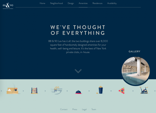
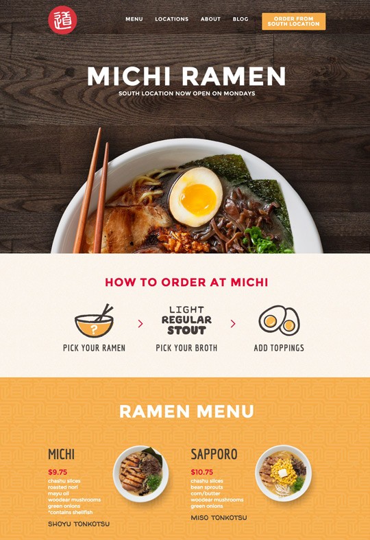
Presenting our first showcase of favourite recent designs from around the web. Be inspired by them, as we are.
“To steal ideas from one person is plagiarism; to steal from many is research.” – Steven Wright
Michi ramen
Chinese and Other Non-Latin Typefaces for the Web – Google Noto to the Rescue
If you’re designing for multiple-language web interfaces, you’ll want to consider Google’s beautiful Noto typeface as a great starting point for non-English views.
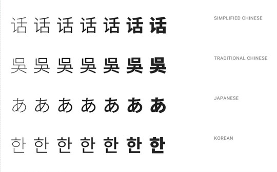
Google’s Noto typeface was designed specifically to support all scripts in the Unicode standard. It is a huge ongoing project that was released into the wild in 2013 to help with font support and consistency on their Android phones.
You can read about the rationale and learn more about it from Google’s own Material Design specifications.
While Google are using this in their mobile device interfaces, we can also use them to our benefit when designing and developing for screens, or even for print.
The Irregular Grid – The Layout to End All Layouts
We’ve been using irregular grid layouts a lot recently. Of all the options for laying out items of content this one keeps asserting itself as the best tool for the job.
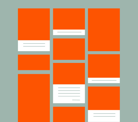
And here’s why.
Contemporary design: considerations for a modern web project process.
In the age of responsive and animated websites, presenting and agreeing designs before moving to code is not what it once was.
Turtle Media project stages used to – and to a large extent still do – follow a Waterfall model, where we first gather requirements and preliminary assets and text, then create wireframes (if the site is warrants it. read why this company doesn’t).
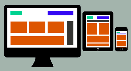
Once we have agreed the structure and possess some project assets, we are ready to create mock-ups of the intended site design for approval. Typically we show key pages; perhaps the home page, a product or service page template, and a blog article page. These are delivered as JPG files, so they don’t move or adapt to different screens. Now that mobile audiences are increasing for virtually all types of websites, we show two versions of how each page will look: desktop and smartphone. Then we ask for approval to begin the coding.