
Contemporary design: considerations for a modern web project process.
- Mar 2015
- Web Design
In the age of responsive and animated websites, presenting and agreeing designs before moving to code is not what it once was.
Turtle Media project stages used to – and to a large extent still do – follow a Waterfall model, where we first gather requirements and preliminary assets and text, then create wireframes (if the site is warrants it. read why this company doesn’t).
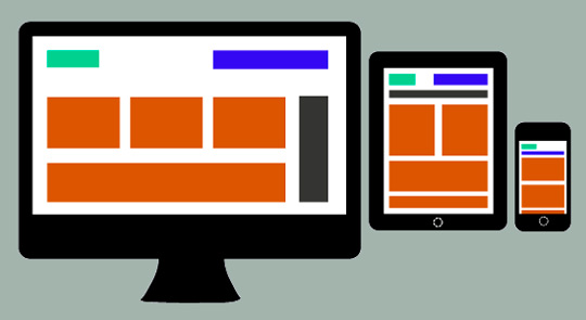
Once we have agreed the structure and possess some project assets, we are ready to create mock-ups of the intended site design for approval. Typically we show key pages; perhaps the home page, a product or service page template, and a blog article page. These are delivered as JPG files, so they don’t move or adapt to different screens. Now that mobile audiences are increasing for virtually all types of websites, we show two versions of how each page will look: desktop and smartphone. Then we ask for approval to begin the coding.
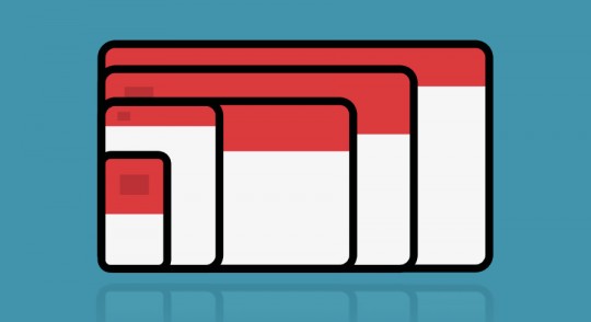
But this is a simplification of what actually happens. The site needs to look good at all viewport widths. A desktop monitor can vary in size and resolution. iPads and smartphones come in many sizes and are used in portrait and landscape view. Even for only three example pages, mocking up three pages for six possible layouts at every round of design is cumbersome and a poor use of time.
JavaScript interactions and animations
Consider a site that has a fixed header navigation or elements on the page that change as you scroll. These things are common to most well-designed contemporary websites but are difficult to communicate, as in this example:
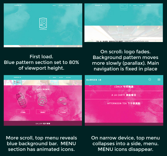
See the above website in action
For elements like this we’ll often show clients similar patterns on other sites to communicate our intentions.
This is where a project is at its most experimental and iterative. Using a variety of animation techniques together, it can be hard to predict the result. Some elements might not play well together from a usability perspective. An effect might cause certain devices to slow down. We prefer to experiment ‘in-browser’ at this stage.
So what does ‘design sign-off’ mean?
When we ask for approval for our designs, we want the client to be satisfied with the overall design mock-ups. We want the static design to be consistent with the brand. To have the right look and feel, and strike the right tone. Then we can confidently begin coding the website safe in the knowledge that they won’t look at the demo in horror, wanting to change everything. Re-coding is more time-expensive than re-designing. To mitigate misunderstandings we also guide the client in what specifically we are trying to finalise at the design stage:
“For these designs, please focus on:
• Overall tone (Does this site feel like your brand?)
• Voice (Is it using language the right way? Is it friendly? confident? Trustworthy?)
• Structure (Too dense? Not dense enough?)
… “
But these days some things necessarily need to be left to testing and play at the coding stage, and in this sense don’t strictly follow a Waterfall methodology. The sketch is representative of what we are trying to do, and things may change during development. That’s just the way it is these days!
Complex interactions make explaining intentions difficult.