
The Irregular Grid – The Layout to End All Layouts
- May 2015
- Web Design
We’ve been using irregular grid layouts a lot recently. Of all the options for laying out items of content this one keeps asserting itself as the best tool for the job.
And here’s why.
A Background to the interest in Pinterest-style grids
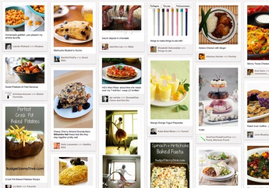
This was initially popularised by the advent of Pinterest in 2010. Based on innovative JavaScript mathemagics that handles stacking items in this way, it can now be found on all manner of website using the Masonry JavaScript library.
It’s possible that some think of it as a copycatting trend, but there are clear advantages to using this method of laying out discrete items, particularly when the content is dynamic and determined to be presented the way it was initially created.
Irregular grids overcome previous limitations or compromises
In the past we might try to restrict the content creator to a fixed amount of text or a specific shape of image. Or resize the image to fit in a fixed size box, resulting in the letterbox effect. Or hide the overflow of the image. Then the user is presented with a regular grid. These are always compromises. Restricting a website editor to a certain size or shape of image can be like tying their hands behind their backs. How can you use a text-heavy poster if the system chops off the sides?
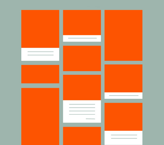
Like with Pinterest, the items that are uploaded or pinned by users need to be of all varieties. Portrait, landscape, square. No caption, or with a long description. Irregular grids allow for this by resizing any content down to the same width, and displaying the content in even columns where items can be of any height.
In circumstances like where the user is in browse mode on a site like Pinterest, the irregular grid is pleasing to the eye. It ensures that no part of the content is cropped, and the screen real estate is used efficiently. In the age of cross-device responsiveness, the even widths are also simple to make flow into fewer columns on narrower viewports.
As website designers and content strategists, we often encounter the need to build a system that accommodates a variety of dynamic and unknowable content. News sections, event pages, press mentions, photo galleries. All lend themselves well to such a system.
There aren’t many issues with the irregular grid. One possible issue is that items could lose their hierarchy. So if we were to build an events section where the chronology of items is essential, the irregular grid could fail us.
A Timeless Layout Design
Until a few years ago such a layout was unheard of. Now it is everywhere and there might be a temptation to label it a trend. As if to imply that this is something that might be superseded by something even better in the near future, and we’ll look back and laugh at our hopelessly quaint solutions.
But some design ideas are archetypal. Natural. Like the regular grid before it. Through a confluence of factors – technology maturing as browsers increasingly adopt similar standards and the proliferation of mobile devices – this design solution will likely forever be the go-to design pattern for arranging items in two-dimensional space.