
Journal.
Why icons are not very good for user experience
Icons are a common element in user interfaces, designed to provide a visual representation of a specific action or concept. While they can be useful for quickly conveying information, the use of icons can also have negative effects on user experience.
![]()
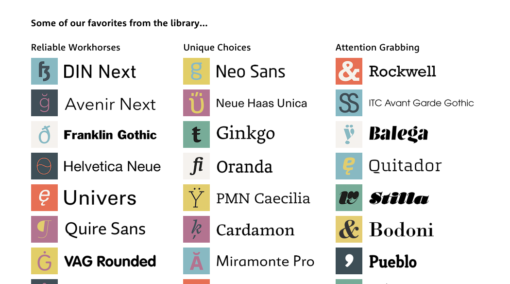
Typography: Design has more details than many would care to know
“Paul Watzlawick’s first axiom of communication—“one cannot not communicate”—puts it very succinctly. If you fail to consider the effect of your message on the recipient, you may inadvertently communicate that you do not care how your message may be received.”
-Erik Spiekermann in foreword to Practical Typography
Websites are Not Print: Pay Attention to the Movement.

The front-end of a website is, naturally, the part that visitors see. The branding, images, illustration, typefaces, overall layout. That these visual aspects are crucial is a given. Every touchpoint of the brand needs to be consistent, and deliver the correct message and tone.
But website pages are delivered across networks, to a variety of devices on networks of different speeds. A page might be beautiful, but if it takes five seconds to load, with all sorts of funky stuff going on in the meantime (90s-style progressive-image reveals, pages jumping around as bits get loaded in, FOUC) this disrupts the experience. It reflects on the brand and the perceived usability. It has been shown to dramatically affect engagement. After three seconds of loading, up to 50% of users will abandon your site. It also contributes to search-engine ranking!
There are a number of strategies to improve performance. Here is an overview of just a few of them.
Desktop and Web Typefaces – An Exciting New Era for Designers
Today Myfonts.com announced a new service allowing designers to subscribe to a vast number of desktop typefaces by Monotype foundries. Over 2200 to be precise.
Combined with webfont subscriptions provided by fonts.com (or typekit), web designers now have an incredible arsenal of fonts to try out, with complimenting systems that make experimentation convenient and cost-effective, contributing hopefully to more interesting design.
Organic Designs by Dana Tanamachi
Dana Tanamachi is based in Brooklyn, and uses chalk to create organic typographical wizardry. We love it.