
Email Signature Design Etiquette 101
- Dec 2014
- Branding
I thought I would write a small piece advising on some best practices for email footer signature designs, prompted by a correspondence I recently received. In today’s world of work communication, email still reigns supreme, so I’d say it’s pretty important to get right.
In short, your email footer should have your name, business name, preferred phone number, and website if you have one. Optionally your job title.
All of your extended contact details and social media channels should be on the website should someone desperately want to follow you after reading your carefully-crafted tome. If there is no website then your preferred social media page could substitute. Though if you don’t have a website you are mad and should call us immediately.
No Images
Don’t do it. Ever. No logos. No animated rainbows. Images get blocked by default on many email clients. They appear as attachments on some others, rendering the recipient clueless as to whether there is an actual attachment to the email. They take up annoying vertical space on already lengthy email chains and thereby frustrate people’s attempts to re-read them.
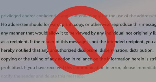
No Disclaimers
Completely pointless, annoying, and threatening. It’s anti-social. Read this excellent dissection on Slate.com.
Other silly practices
Don’t put your email address! Don’t put your fax number. Don’t put a lengthy office address. Don’t put an inspirational quote.
Good Practices
When nine-tenths of an email chain is taken up with useless signature guff, it is impossible to scan for information. Keep It Simple, Stupid. People appreciate humble, clear, concise, brevity, free of clutter. Bear in mind that many people you communicate with will be exposed to this a lot.
Peruse the DAFTAs, an award to the most incomprehensible email signature.