The turtles get their fourth shell
- Mar 2021
- Company News
It’s such a cliché when the chef heads home and eats instant noodles. The carpenter’s house is full of broken furniture. But so it was: that our nine-year-old website had gone fallow.
Not a great look. It’s something of a luxury though; being busy with paying projects kept us from applying the careful thought and planning required to refresh our own online presence.
But the time had come.
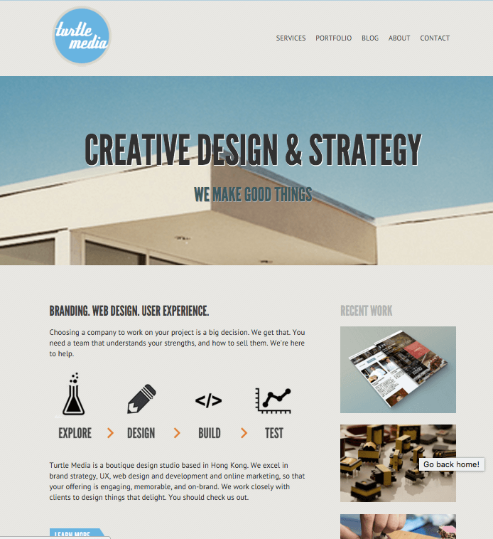
Our last site was built at the advent of the responsive web in 2012. Sites that adapted to the screen was bleeding-edge back then. We hand-coded the front-end. But it was looking tired. And without a framework, and an outdated custom-PHP backend, content and design updates were fiddly and so were infrequent.
For projects we now use Tailwind as our preferred, utility-first CSS framework. We have earned a deep understanding of WordPress and are able to make it do powerful and dazzling things. We are able to track conversions better, and tie these to marketing efforts for a much better picture of what is working and what needs more attention.
It was time to eat our own dog food and leverage these for our own site.
With Google increasingly using site performance metrics as search rank factors we had slipped in recent months. We hope to see an improvement in visibility, engagement, and conversions, with this, an online presence that speaks more authentically to who we are today.
A re-brand
We also used the opportunity to do a brand refresh. The old brand blue felt corporate, dry, and conventional. I wanted something that derived its personality from strong and distinctive typography. Clean, minimal, humble.
Web conventions have evolved. We don’t need big buttons to denote links anymore. We don’t have to lead with a big banner image with overlaid headline. We don’t need to put the ‘About Us’ page first in the navigation. We also don’t need a logo that says our full company name in a big shiny illustrated mark. We opted for using TM as the primary logo. We’re virtually paperless, existing almost exclusively online like the Lawnmower Man or Max Headroom. People who find our site already know us, or have seen our name in search results or a social media link. They can see it in the URL, in the title tag, or in the body copy.
We let the brand reveal slowly through consistent and careful type, subtle animation, judicious colour usage, good copy, and a minimalistic layout.

Showing our work
For us the most important part of our marketing is our portfolio. The new design emphasises a few key projects as more detailed case studies, rather than just a paragraph and a few screenshots.
We supplement this with a more complete list of clients by industry, often with links to the relevant site. This is to show our breadth of experience at a glance.
Enjoy
So please explore our new site. Criticism and praise are always welcome.

