
Handling responsive images on the web, with a focus on WordPress
- May 2020
- Web Design
Optimised images on the web are important for performance and user experience, which in turn are important for search engine visibility and engagement.
With changes to the way WordPress handles images in late 2019, we are taking a careful approach to handling images on the modern web. The main goal: to ensure that the browser loads an appropriately-sized image for its current context. It’s not as easy as it sounds.

Responsive images go beyond media queries
In the early days of small-screen internet, screens were mostly around 72 pixels per inch, so we could just use media queries to direct the browser to a reasonable-sized image (i.e. don’t send a 2000px header image to a 320px-wide mobile phone, wasting precious bandwidth). But towards 2014 this was losing effectiveness.
As a response to the burgeoning range of device sizes and resolutions (like Apple’s Retina screens), and the associated problems of choosing the right image size to deliver, in 2014 the W3C Working Group introduced the source-set attribute.
Source-set (srcset) allows us to tell the browser a range of image sizes that we have, and how they’re being used in the layout (100% width, 30em wide, etc) and lets the browser choose which it wants to use.
This is fiendishly clever: rather than having to give explicit instructions for the innumerable environments that a user might have, we let the browser do the hard work. Browsers could now pick an image based on the variety of information they have. This could include screen density and size of course, but also bandwidth or even battery. This article from 2015 has more information on the philosophy and implementation for those interested.
WordPress’ handling of images
In 2015 WordPress implemented srcset when handling some images, and in 2019 WordPress 5.3 changed the way they handle image uploads in response to the general increase in consumer image resolutions and file sizes.
So today WordPress creates a large range of image versions (original, scaled:2560, 2048×2048, 1536×1536, medium_large:768) every time an editor uploads an image to the media library. That’s a lot of pics to store. It then makes some effort to indicate to the browser the image versions it might use.
WordPress, like all code, is opinionated. The 2019 image changes are mainly to allow non-technical users to ignore concerns about image sizes, as their largest market is basic bloggers (no offence intended). They can upload their 5mb iPhone photos directly, and WordPress will use the ‘scaled’ 2560px version, which will be much smaller (dependent somewhat on implementation by theme developers). This improves front-end performance and server load. But it’s slightly lowest-common-denominator stuff. Some would argue, so is WordPress 5 in general!
For a lot of people it creates more problems than it solves. For photographers who want users to see or download the original high-res images, suddenly it doesn’t work like that anymore. And of course as developers of bespoke business sites, we want more control than that.
There are different ways to end up with dynamic images on a WordPress website:
- Inserting an image into a WYSIWYG text editor (classic editor)
- Uploading an image to a custom component using a custom field like ACF, that is then inserted via either HTML, or using it as a background image via CSS.
This is where things start to get complicated. We have to do a lot of non-default things and make some compromises to get the performance to where we want it:
- The default srcset code from WYSIWYG editors is not ideal. We need to write the srcset sizes attribute customised for every unique component in the template
- Images inserted with custom fields don’t automatically use the srcset code. We need to write this out too, per component
- Background images can’t use srcset as they’re not img or picture HTML tags
- If clients upload images that are below the scaled image size, the versions created can be unpredictable.
So, for each non-background image component, we are creating an inventory table of asset specifications – how each image is presented at each breakpoint on the site.
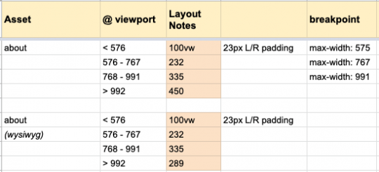
Then we translate this into srcset attributes. For WYSIWYG images we use filters to adjust the default WordPress srcset/sizes. For other non-background images we write custom functions. For background images we need to take the old media query approach.
Now: modern browsers will happily choose an appropriate image in each area, meaning happier users and servers, and therefore happier clients and developers.
Another spanner in the works: Image compression
The complexity doesn’t end there. WordPress doesn’t compress images very well. For this we connect to a third-party service called TinyPNG (anyone can use this for free to optimise their images). This smushes all the JPGs and PNGs on upload, to reduce their file size often by as much as 60%, without any perceptible loss in quality. Doing this step helps to reduce storage use on the server, and improves front-end performance and bandwidth usage.
But TinyPNG does some funky stuff. It seems to be confused about the WordPress 5.3 change, and what it calls ‘original image’ in the settings is actually the ‘scaled’ image. So it no longer compresses the original image! But this is the most important as it could be huge. This is something we are speaking with TinyPNG’s excellent team about.
Conclusion
The above approach probably does add 10-20% to the front-end development efforts, but with site loading performance being super important in engagement and in SEO, we think it’s worth it. For larger, busier sites, it’s also an important element of server optimisation.
There’s a danger of overthinking. The rabbit-hole goes deep. Most clients aren’t going to tolerate doubled project costings because we want to spend a week fully-optimising every image. We need to strike a balance between performance, editor complexity, development time, and server overheads.
Some of the above strategies are new to our workflow. It’s possible we’ve missed something that could make it simpler. It could be overthinking in some areas, or not enough in others. Time will tell.