
Breaking From The Expected In Modern Web Design
- Jan 2017
- Web Design
As the modern web matures, visitors are savvier. We would argue that they can smell a design template, a stock photograph, or a cliché a mile off. It might be worth going the extra mile to distinguish your brand.
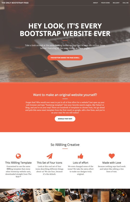
An irreverent comment on the futility of using off-the-shelf templates? Sweary words redacted.
The screenshot above is from a joke webpage that pokes fun at the myriad companies using Bootstrap templates for their web presence. Bootstrap is a front-end framework originally designed to allow developers to create Rapid Prototypes of their ideas using simple and repeatable code patterns.
It has since morphed into a quick and cheap way to build simple websites, with off-the-shelf themes available either standalone or baked into countless WordPress or other platform templates.
The trouble is, it shows. Alongside the ubiquitous skyline shot, or corporate shaking-hands-in-front-of-a-fancy-glass-building stock photograph, the same familiar patterns keep popping up. Each time losing potency. Losing the audience’s attention faster than a ‘share this on Twittergram’ button.
One size fits all
There are a couple of reasons that themes for WordPress, Bootstrap, etc. tend towards the familiar and generic.
The first is that the graphic trends of the day are disproportionately copied and sought, spreading through the theme libraries like a viral cat video. Like photographs that cover the screen that were impressive when responsive design first took hold (before which most sites were of a fixed width). Or the ‘flat’ design made popular by Windows 7, spawning an abundance of web buttons that you weren’t sure if they were buttons.
The second reason is more nuanced. When creating a layout intended for a variety of end-uses, certain patterns lend themselves as more universally applicable. For example, a large slideshow with arrows and a row of dots for navigation can be used for different purposes by theme-purchasers. Grids of product images – in the absence of information about what actual products will go into the boxes – will tend to be symmetrical and possibly bland.
All of these design patterns have their place, but when crudely applied in aggregate the effect can be insipid.

Strive for the distinct
On the face of it it makes good sense: grab a free template, spend a few hours customising it, and voilà! – a fully working website that looks competent. What could go wrong?
The problem with shortcuts like this is that they may betray that little effort has gone into the design. In our view, that is bad for most serious brands’ image. Especially when coupled with ill-considered marketing copy, and/or generic stock photography.
A quick and dirty website is just that. It doesn’t stand out. At least not in a good way. It doesn’t show attention and love have been given to the details. It’s a missed opportunity to stand out from the crowd. To plant your flag.
Caveat
To be clear: there’s nothing wrong with using shortcuts to a point. WordPress allows us to create reasonably complex websites faster than rolling-your-own Content Management System for every project. Bootstrap is a fine starting point for creating responsive webpage layouts quickly and allows us to concentrate on the harder parts.
Templates and stock photos may be suitable for smaller organisations on a budget – a local laundry or a piano teacher perhaps.
There is also nothing wrong with design conventions. In fact, we regularly push for web conventions that allow users to quickly recognise familiar design patterns to reduce their cognitive load. Things like placing the logo at the top and having it link to the homepage, calling the page ‘services’ instead of ‘the things we do’, or using underlined text to show in-line links.
Some design strategies
We’ve seen a lot of over-used patterns creeping into even bespoke websites. They’re not using a template, but they still opt for the slideshow dots underneath and default triangle arrows underneath. That is just not good enough.
In our experience, a visual brand will usually cry out for a unique approach to nearly every element on the page. Just as we would choose typefaces to match the organisation’s logotype, so we should also match the icons, arrows, colour palette. If the logo uses square motifs, then the slideshow dots should also be squares!
Similarly, the layout should be customised to match the content going in. If the business has two products or services, and one is more important than the other, then they should not be presented at the same size, symmetrically on the page.

Symmetry
In fact, symmetry is something that we recently try to move away from wherever possible. An asymmetric design immediately shows that a page has been carefully hand-curated. It joins the ranks of the top 5% by this simple trick.
The history of web design in its infancy pushed towards order, balance, symmetry. But many of these guiding principles have been cast off with time, either through changes in expectation or as technology has moved the web to a plethora of devices. We no longer expect the website to fit onto the screen without scrolling, like a page from a brochure. We no longer expect websites to be a fixed width regardless of the screen. We no longer think of layouts as fixed and rigid as we move to consuming the web on mobile devices, in portrait and in landscape.
Build your brand
Your organisation’s website is no different to any other touchpoint with your customers. It’s an opportunity to convey the values, voice and tone of your brand DNA confidently and consistently.
This is rarely achieved through following the well-beaten path before us. Branding doesn’t stop at an attractive logo. It should flourish through the considered design of your photography, copywriting, web design, customer service.